# MDX component showcase
A review surface for the Plandalf docs components that mirror the Mintlify-style documentation primitives.
Source: /docs/components/showcase
Last modified: 2026-06-20
This page is a visual QA surface for the docs component system. It shows the primitives that authors can use when writing implementation guides, API reference pages, and SDK walkthroughs.
> **Component goal**
>
Components should make the implementation path easier to scan without turning docs into marketing copy. Use cards for choices, steps for sequence, lists and tables for compact structure, fields for API shape, and examples for request or response code.
## Page notices
> **Mintlify-style coverage**
>
This page includes the Plandalf versions of Cards, Tiles, Steps, CodeGroup, Fields, Responses, Examples, Callouts, Banner, Prompt, Snippet, Expandable, Columns, Column, Panel, Frame, Badge, Update, Mermaid, Tree, Color, Tooltip, View, Visibility, and Icons.
> **Maintenance notice**
>
Dismissible banners can be used for local docs announcements and preview warnings.
## Component catalog
Use this catalog to jump to the visual QA section for the component family you are checking.
**Structure content**
- [Tabs](#code-blocks): Switch between platform or language-specific content.
- [Code groups](#code-blocks): Show equivalent snippets across languages or install paths.
- [Lists and tables](#lists-and-tables): Use compact Markdown structure before heavier component surfaces.
- [Steps](#steps): Guide readers through ordered implementation work.
- [Columns](#lists-and-tables): Put related prose, tables, or snippets side by side.
- [Snippet](#supporting-details): Show compact copyable values inside prose.
- [Panel](#supporting-details): Add side context without interrupting the main path.
**Draw attention**
- [Callouts](#callout-aliases): Highlight notes, tips, warnings, checks, and custom notices.
- [Banner](#page-notices): Place dismissible or persistent page-level announcements.
- [Badge](#supporting-details): Add small status labels inside prose, tables, or reference rows.
- [Update](#supporting-details): Mark dated changes without making a full changelog page.
- [Frame](#images-and-embeds): Wrap screenshots, browser previews, and embedded surfaces.
- [Tooltip](#supporting-details): Clarify terms inline without adding another paragraph.
**Showcase AI prompts**
- [Prompt](#prompt): Display copyable AI prompts and agent instructions.
**Show and hide content**
- [Accordions](#supporting-details): Group optional detail under clear questions or labels.
- [Expandables](#supporting-details): Reveal setup notes, caveats, or advanced paths on demand.
- [View](#view-and-visibility): Target content to human readers, agents, or both.
- [Visibility](#view-and-visibility): Keep agent-only instructions out of the human docs page.
**Document API shape**
- [Fields](#api-fields): Describe request parameters, attributes, and nested objects.
- [Response fields](#api-fields): Show response payloads with types and required markers.
- [Examples](#api-fields): Pair request snippets with realistic response examples.
**Link to other pages**
- [Cards](#cards): Use richer linked surfaces for important next pages.
- [Tiles](#tiles): Use compact icon grids for dense navigation and choices.
**Visual context**
- [Icons](#supporting-details): Use bundled icons, image icons, or inline SVG when porting MDX.
- [Mermaid](#visual-context): Render simple diagrams for flows and system handoffs.
- [Color](#visual-context): Show named colors or swatches inside docs examples.
- [Tree](#visual-context): Describe folder structures and generated files.
## Callout aliases
> **Note**
>
Use named callout components when porting Mintlify-style MDX directly.
> **Tip**
>
Use tips for helpful implementation advice that should stand out but not interrupt the page.
> **Warning**
>
Use warnings for constraints that can break an integration if ignored.
> **Customized alias**
>
Named callout aliases forward Mintlify-style customization props instead of only supporting `title` and `icon`.
> **Check**
>
Use checks for completion states, verified setup, or recommended defaults.
> **Custom callout**
>
Generic callouts support custom icons, icon types for MDX compatibility, and color tints.
## Cards
### [Install the SDK](/docs/sdk/install)
Load the browser package and confirm that the global object is available.
### [Configure checkout](/docs/sdk/configure)
Choose modal, slideout, bottom sheet, fullscreen, or inline behavior.
### [Listen for events](/docs/sdk/events)
React to checkout lifecycle changes from the browser.
### [Inline SVG icon](/docs/components/showcase)
Cards accept inline SVG strings for Mintlify-style icon portability.
### [Horizontal card](/docs/components/showcase)
Use horizontal cards for compact links inside dense implementation guides.
### Typed warning card
Typed cards use the same visual language as callouts when the whole container needs emphasis.
### [Image card](/docs/offers/overview)
Image cards can frame screenshots or product surfaces without nesting a card inside another card.
### [Layer card](/docs/offers/overview)
Use for high-value next steps.
Layer cards give important navigation choices a richer surface without nesting cards inside other cards.
### [Compact linked card](/docs/sdk/install)
Linked cards get a default icon.
Compact cards keep dense grids readable when a page needs several next links.
## Tiles
### [Offers](/docs/offers/overview)
Checkout surface
### [Timers](/docs/timers/overview)
Deadline engine
### [Events](/docs/sdk/events)
Browser stream
### [Webhooks](/docs/api/webhooks)
Backend handoff
### [Stripe](/docs/platforms/stripe)
Payment platform
### [Inline SVG](/docs/components/showcase)
Use this when a docs page is ported from Mintlify with custom icon markup.
## Code blocks
```js open-offer.js lines
window.Plandalf.openOffer({
offerId: "offer_123",
mode: "modal",
});
```
```bash filename=long-install-command.sh wrap expandable
npm install @plandalf/js @plandalf/react && npx plandalf init --offer offer_123 --mode modal --redirect /thanks --events checkout.started,checkout.completed,checkout.dismissed
```
```ts checkout-result.ts lines highlight="2-4" focus="2-6"
type CheckoutResult = {
status: "completed" | "dismissed" | "failed";
checkoutId?: string;
offerId: string;
};
export function handleCheckout(result: CheckoutResult) {
if (result.status === "completed") {
window.location.href = `/thanks?checkout=${result.checkoutId}`;
}
}
```
```js title=event-handler.diff diff lines
window.Plandalf.on("checkout.completed", (event) => {
console.log(event.checkoutId); // [!code --]
analytics.track("Checkout completed", event); // [!code ++]
window.location.href = "/thanks"; // [!code ++]
});
```
### custom-code-block.ts
```ts
type CheckoutMode = "modal" | "slideout" | "inline";
export function openOffer(offerId: string, mode: CheckoutMode = "modal") {
return window.Plandalf.openOffer({
offerId,
mode,
});
}
```
### wrapped-cli-command.sh
```bash
npx plandalf init --offer offer_123 --mode modal --redirect /thanks --events checkout.started,checkout.completed,checkout.dismissed
```
### Install options
```html
```
```tsx
import { PlandalfProvider } from "@plandalf/react";
export function App({ children }) {
return {children};
}
```
### Dropdown code group
```html
```
```js
window.Plandalf.openOffer({
offerId: "offer_123",
mode: "modal"
});
```
```ts
window.Plandalf.on("checkout.completed", (event) => {
console.log(event.checkoutId);
});
```
### What the checkout snippet does
- `offerId: "offer_123"` - Selects the Plandalf Offer that owns the products, prices, checkout content, and follow-up automation.
- `mode: "modal"` - Opens the buying surface over the current page instead of sending the customer away immediately.
### Choose an implementation style
Use this for Plandalf-specific guides that need short generated code samples from structured data.
Use this on static pages and CMS templates.
```html HTML
```
Use this when the page owns the click handler.
```js JavaScript
window.Plandalf.openOffer({ offerId: "offer_123" });
```
### Single example
```json completion-result
{
"status": "completed",
"checkoutId": "checkout_123"
}
```
### Tabbed example
```js Browser
const result = await window.Plandalf.present("founder-plan");
```
```ts Server
await plandalf.checkout.sessions.create({
offerId: "founder-plan",
});
```
### HTML
Use plain HTML when the page is static, CMS-owned, or built in a no-code tool.
### React TSX
Use React when the buying action depends on logged-in state, app routing, or component-level events.
### Stripe
Use image icons when a tab represents a platform, framework, or payment provider.
### JavaScript
Selecting this tab also selects matching JavaScript tabs and code groups on the page.
### Python
Matching titles stay synchronized for language and framework choices.
### JavaScript
This tab group is independent because `sync` is disabled.
### Python
Use this when matching labels mean different things in two nearby panels.
## API fields
### SDK API surface
Use API surface summaries for Plandalf-specific SDK pages that need a compact method map.
- [openOffer](/docs/sdk/configure) `Plandalf.openOffer({ offerId, mode })` - Opens an Offer from a button, link, or custom page action.
- [on](/docs/sdk/events) `Plandalf.on("checkout.completed", handler)` - Listens for checkout lifecycle events in the browser.
### Implementation path
Use visual flows sparingly when a page needs to show how Plandalf primitives connect.
- [Create the Offer](/docs/offers/create) - Define the buying surface, products, price, and checkout content.
- [Install the SDK](/docs/sdk/install) - Place the browser script or framework package in the host page.
- [Handle events](/docs/sdk/events) - React to checkout completion and send the useful context to your backend.
- `offerId` (string; required, placeholder: offer_123):
The offer identifier from the Plandalf dashboard or API.
- `mode` ("modal" | "slideout" | "inline"; default: modal):
Controls how checkout opens on the page.
- `include` (string[]; placeholder: line_items,invoices):
Optional response expansions for API-style endpoints.
- `preview` (boolean; default: false):
Boolean defaults render cleanly instead of relying on string-only metadata.
- `Idempotency-Key` (string; deprecated):
Optional request header for retry-safe API calls.
- `customer` (object; required):
Customer context passed into checkout when your app already knows the buyer.
- `customer.email` (string; required, placeholder: buyer@example.com):
Email address used for receipts, buyer matching, and follow-up automation.
- `customer.external_id` (string; placeholder: user_123):
Stable identifier from your app.
### Checkout request fields
- `offer_id` (string; required, placeholder: offer_123):
The offer opened by the checkout session.
- `success_url` (string; placeholder: https://example.com/thanks):
The page Plandalf can send the customer to after checkout completes.
### Quiet field list
- `customer_id` (string; placeholder: cus_123):
Optional buyer identifier from your app.
- `expand` (string[]; default: []):
Additional objects to include in the response.
- `checkoutId` (string; data, required):
The completed checkout session identifier returned after the customer finishes checkout.
- `status` ("open" | "completed" | "expired"; default: open, enum):
The current checkout session state.
- `attempt_count` (number; default: 0):
Numeric defaults keep their API shape in the field metadata.
- `line_items` (array):
Returned when the response includes expanded invoice or cart data.
- `customer` (Customer Object):
Buyer details returned when checkout is attached to a known customer.
> **properties**
>
- `full_name` (string):
The customer's display name when it is available.
- `email` (string; required):
Email address used for receipts and buyer matching.
- `offer` (object; data, required):
The offer snapshot attached to the checkout session.
- `offer.id` (string; required):
Stable offer identifier.
- `offer.currency` (string; default: usd, ISO 4217):
Currency used for the displayed checkout price.
- `offer.metadata` (object; default: { source: "docs-showcase" }):
Custom metadata attached to the offer snapshot.
### Checkout response fields
- `id` (string; required):
Stable checkout session identifier.
- `status` ("open" | "completed" | "expired"; required):
Current state of the checkout session.
### Quiet response list
- `livemode` (boolean; default: false):
Whether the checkout session was created against a live payment connection.
- `created_at` (string; ISO 8601):
Timestamp for the session creation event.
### Compatibility response alias
- `object` ("checkout.session"):
The object type returned by this response.
### Request and response
### Create checkout session
```bash
curl https://api.plandalf.com/v1/checkout/sessions \
-H "Authorization: Bearer $PLANDALF_API_KEY" \
-d offer_id=offer_123
```
```js
await fetch("https://api.plandalf.com/v1/checkout/sessions", {
method: "POST",
headers: {
Authorization: `Bearer ${process.env.PLANDALF_API_KEY}`,
"Content-Type": "application/json"
},
body: JSON.stringify({ offer_id: "offer_123" })
});
```
### Checkout session response
```json
{
"id": "checkout_123",
"status": "open",
"offer_id": "offer_123"
}
```
```json
{
"error": {
"code": "invalid_offer",
"message": "Offer could not be found."
}
}
```
## Prompt
> **Agent implementation prompt**
>
Implement a Plandalf buy button that opens one test offer, listens for checkout completion, and sends the completed checkout ID to my backend.
> **Generate a complete implementation plan for adding Plandalf checkout to an existing product page.**
>
You are helping me add Plandalf to an existing site.
- Start with one test Offer and one buy button.
- Use the browser SDK before adding backend webhooks.
- Explain the files you would change and include code samples.
- Link terms like Offer, Timer, event, and webhook back to the relevant docs page.
> **Does the plural alias work?**
>
Yes. `Accordions` maps to `AccordionGroup` for imported Mintlify-style MDX.
## Supporting details
> **When should this be expanded?**
>
Use expandable sections for rare constraints, platform caveats, or migration details that matter but should not interrupt the main path.
> **Collapsed by string prop**
>
This should stay collapsed when an author writes `defaultOpen="false"` in MDX.
Imported Mintlify MDX may omit the title on nested API expandables. Plandalf falls back to `properties` instead of rendering an empty control.
> **Can this be linked directly?**
>
Yes. Opening an accordion updates the URL hash, and loading the page with that hash opens the matching item.
> **When should an accordion be default-open?**
>
Keep secondary caveats collapsed. Default-open accordions should explain the immediate next step or the most common branch.
You can add inline help with a tooltip, a plain definition, or a small icon [icon: lightbulb] when a sentence needs a compact signal. Mintlify-style icon prop aliases work too [icon: flag]. Numeric icon sizing also works [icon: sparkles].
Use `offer_123` for a copyable ID, `PLANDALF_API_KEY` for an environment variable, or `modal` when the value should read like inline code without a copy affordance.
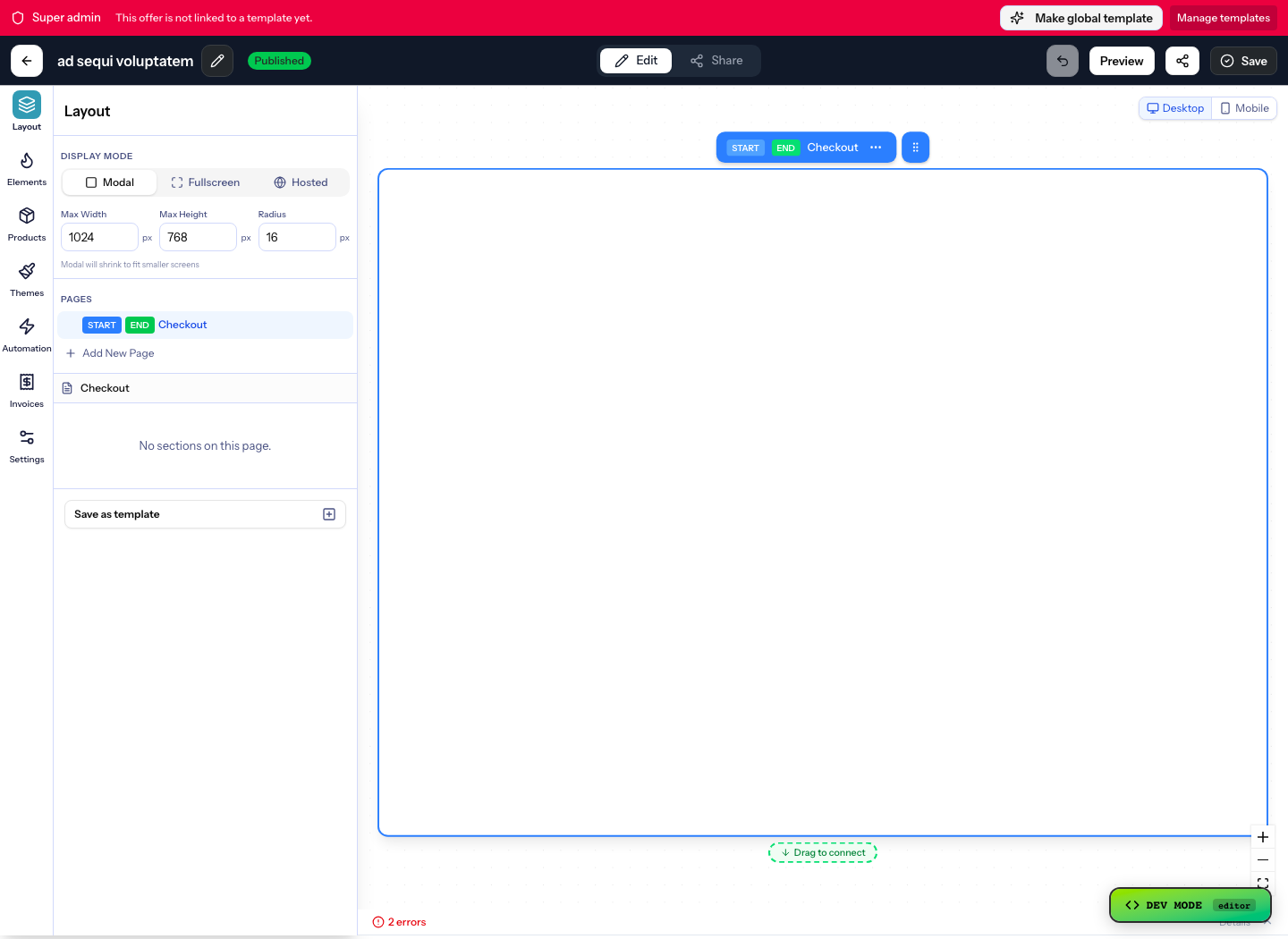
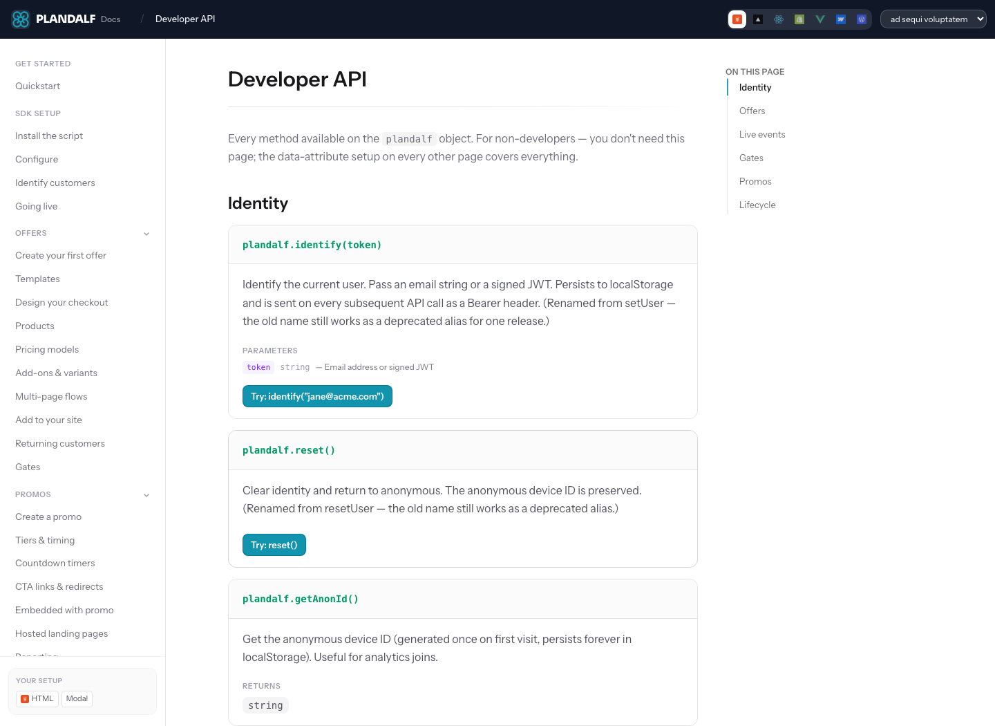
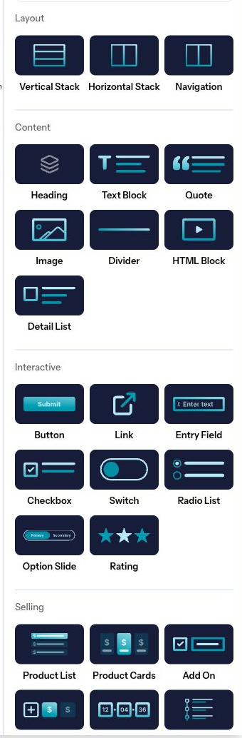
The docs system now supports richer media frames, badges, tooltips, changelog-style updates, tabbed examples, API fields, and recursive sidebar groups.
Preview tiles now support direct `img` and `imgAlt` props as well as child media.
- Use compact tiles for dense navigation.
- Use preview tiles for screenshots, component previews, and visual choices.
Premium
Verified
Beta
Locked
With tooltip
SVG
className
> **Good docs component use**
>
Keep the page moving forward. Components should reveal structure, not decorate every paragraph.
> **Avoid**
>
Do not nest cards inside cards, and do not turn every concept into a box.
> **Right rail panel**
>
Like Mintlify, a plain `Panel` replaces the right table of contents on desktop. Use `inline`, `rail={false}`, or `placement="inline"` for compact in-flow panels.
> **Panel with examples**
>
> **Pinned example**
>
A Panel can own request and response examples when the whole right rail should be contextual.
### Panel request
```js
await fetch("/api/checkout", {
method: "POST",
body: JSON.stringify({ offerId: "offer_123" })
});
```
### Panel response
```json
{ "status": "created" }
```
## Visual context
### Checkout handoff
```mermaid
graph TD
Button[Buy button] --> Offer[Plandalf Offer]
Offer --> Payment[Payment stack]
Offer --> Events[SDK events]
Events --> Backend[Backend handoff]
```
docs
├─ sdk
│ ├─ install.mdx
│ └─ configure.mdx
└─ api
├─ authentication.mdx
└─ reference.mdx
- content/
- docs/
- introduction.mdx
- quickstart.mdx
- products/
- offers.mdx
- timers.mdx
- docs.json
- snippets/
- install.mdx
- offer-glossary.mdx
- assets/
- checkout-preview.png
- Plandalf primary: #0f8f8c
- Theme surface: { light: "#ffffff", dark: "#0f172a" }
- hex: #0f8f8c
- rgb: rgb(15, 143, 140)
- rgba: rgba(15, 143, 140, 0.72)
- hsl: hsl(179, 81%, 31%)
- oklch: oklch(58% 0.12 185)
- theme pair: { light: "#ffffff", dark: "#0f172a" }
#### Brand
- Primary: #0f8f8c
- Primary soft: #ccfbf1
#### Surfaces
- Canvas: { light: "#ffffff", dark: "#0f172a" }
- Aqua wash: #effdfb
## View and visibility
### JavaScript
Use the browser SDK when the checkout action lives on a plain page or CMS template.
### JavaScript setup
```js
window.Plandalf.openOffer({
offerId: "offer_123",
mode: "modal"
});
```
### Python
Use a backend call when your server needs to prepare customer context before checkout.
### Python setup
```python
session = plandalf.checkout.sessions.create(
offer_id="offer_123",
customer={"external_id": "user_123"}
)
```
### Launch checklist
Use named icons for operator-facing variants that are not programming languages.
```md
- Test the offer
- Confirm checkout events
- Connect the backend handoff
```
### Agent-only hidden view
This titled view is reserved for agent output and should not render in the web docs UI.
### Agent-only imported view
This uses the same `for="agents"` audience prop as Mintlify-style conditional content.
Agent-only Markdown export note.