# Visual context components
Use Mintlify-style icons, Mermaid diagrams, color swatches, trees, frames, and images to explain implementation context.
Source: /docs/components/visual-context
Last modified: 2026-06-20
Visual context components make implementation details easier to understand when prose alone becomes slow. Use them for diagrams, file trees, color values, screenshots, and compact icon signals.
> **Use real product visuals**
>
Product UI in docs should come from tracked media or real screenshot components. Do not invent abstract app panels for product behavior.
## Icons
Icons can come from the built-in Plandalf set, Lucide names, image paths, or inline SVG. Use icons to label choices, fields, and navigation surfaces.
> **Built-in icon**
>
`package` is used for Offers and checkout setup.
> **Lucide icon**
>
Broader Lucide names normalize through the shared renderer.
> **Image icon**
>
Platform icons can use image paths.
```mdx icons.mdx
[icon: package]
[icon: panel-left-open]
[icon: /platforms/stripe.svg]
```
## Mermaid diagrams
Use Mermaid when a process is clearer as a flow. Keep diagrams short enough to scan in the right pane or main article.
### Offer checkout flow
```mermaid
flowchart LR
Page[Sales page] --> Offer[Plandalf offer]
Offer --> Checkout[Checkout]
Checkout --> Payment[Payment processor]
Checkout --> Event[Purchase event]
Event --> Automation[Automation]
```
````mdx mermaid.mdx
### Offer checkout flow
```mermaid
flowchart LR
Page[Sales page] --> Offer[Plandalf offer]
Offer --> Checkout[Checkout]
Checkout --> Payment[Payment processor]
Checkout --> Event[Purchase event]
Event --> Automation[Automation]
```
````
## Trees
Use `Tree`, `Folder`, and `File` for project structure, generated files, and docs examples that require exact locations.
- src/
- checkout/
- plandalf.ts
- events.ts
- env.ts
- README.md
```mdx tree.mdx
- src/
- checkout/
- plandalf.ts
- events.ts
- env.ts
```
## Color
Use color swatches when a docs page needs literal theme values. Swatches are copyable and can show light and dark values.
- Aqua surface: #e7f9fa
- Primary teal: #0f8f8c
- Charcoal text: #142023
- Theme-aware surface: { light: "#f8fbfb", dark: "#102326" }
```mdx colors.mdx
- Aqua surface: #e7f9fa
- Primary teal: #0f8f8c
- Theme-aware surface: { light: "#f8fbfb", dark: "#102326" }
```
## Images and frames
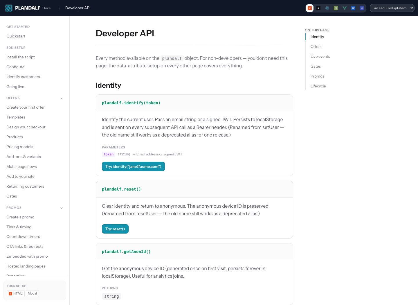
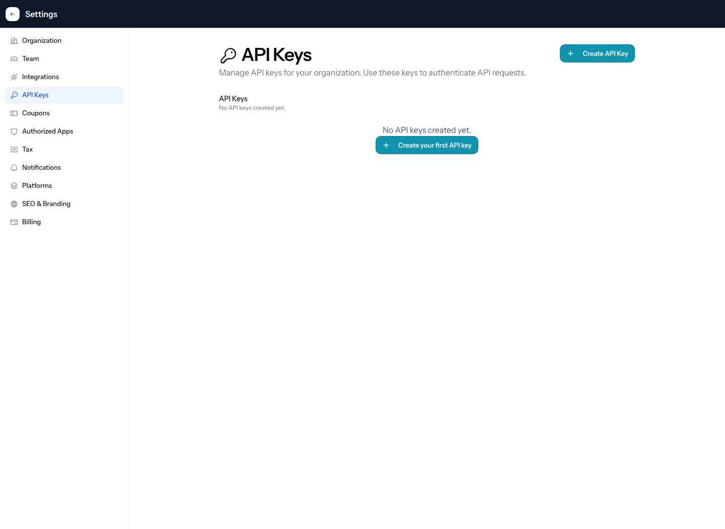
Use `Frame` around product screenshots, diagrams, and embeds that need a caption. Use tracked media for product surfaces. Markdown and HTML images are also supported for smaller authoring examples, including `noZoom`, links, and light/dark variants.
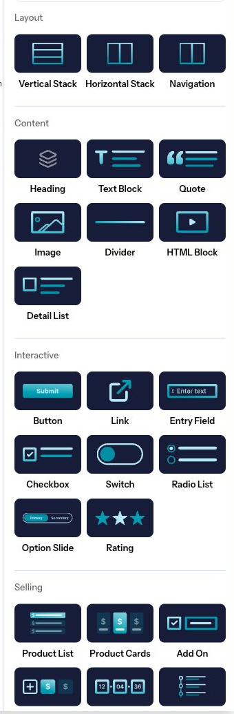
```mdx frame-image.mdx

```
### Markdown and HTML images
Use Markdown image syntax when the default sizing is enough. Use `` when the image needs `className`, inline sizing, `noZoom`, or a linked wrapper.

```mdx title="images-and-zoom.mdx"



```
### Theme-specific images
Use visibility classes when one screenshot is only correct in light or dark UI. The alt text should still describe the image rather than the theme.


```mdx title="theme-images.mdx"


```
### Iframes and embeds
Wrap iframes in `Frame` so the embed stays within the reading column and cannot create horizontal overflow. Use `allowFullScreen` and camelCase JSX attributes for video embeds.
```mdx title="iframe-frame.mdx"
```
- `iframe` (title, className, allowFullScreen):
Plandalf docs render normal JSX iframe attributes. Always include a descriptive `title`, size the embed with `className`, and use `allowFullScreen` when the embedded player supports full-screen playback.
## Icon and diagram properties
- `Icon.icon` (string; required):
Built-in Plandalf name, Lucide alias, image path, or inline SVG string.
- `Icon.iconType` (string):
Icon style metadata from imported Mintlify MDX.
- `Icon.color` (string):
Optional local color for inline icons.
- `Mermaid.title` (string):
Label shown above the diagram.
- `Mermaid.actions` (boolean | auto; default: auto):
Shows zoom and pan controls for diagrams that benefit from inspection.
- `Mermaid.placement` (top-left | top-right | bottom-left | bottom-right; default: bottom-right):
Places Mermaid action controls inside the diagram frame.
## Tree properties
- `Tree.title` (string):
Optional heading above the file tree.
- `Folder.name` (string; required):
Folder label.
- `Folder.defaultOpen` (boolean; default: false):
Opens the folder on first render. Use it for the path the reader should inspect first.
- `Folder.openable` (boolean; default: true):
Allows the folder to be toggled open and closed.
- `Folder.icon` (string):
Optional icon override for the folder.
- `File.name` (string; required):
File label.
- `File.icon` (string):
Optional icon for code, config, key, or docs files.
## Color, media, and embed properties
- `Color.title` (string):
Palette heading when `Color` wraps nested color items.
- `Color.name` (string):
Color item label.
- `Color.value` (string | { light: string; dark: string }):
Copyable color value or theme-aware pair.
- `Color.variant` (compact | table; default: compact):
Palette display style.
- `Frame.caption` (string):
Caption shown beneath media.
- `Frame.hint` (string):
Short context line above the media.
- `Frame.variant` (default | flat | browser; default: default):
Visual frame treatment.
- `img.src` (string; required):
Image source for Markdown or HTML images.
- `img.alt` (string; required):
Accessible image description.
- `img.noZoom` (boolean; default: false):
Disables the docs image zoom enhancer for linked images, small logos, or images inside framed components.
- `iframe.title` (string; required):
Accessible title for an embed.
- `iframe.allowFullScreen` (boolean):
Allows full-screen playback for video embeds.
## Related components
- [Attention components](/docs/components/attention): Use frames beside banners, badges, and tooltips.
- [Cards and tiles](/docs/components/cards-tiles): Use icons and preview media in navigation surfaces.
- [Component showcase](/docs/components/showcase): Review every visual variant on one page.