
Tiles
Use tiles for dense icon grids, component catalogs, and compact next-page navigation.
Tiles are lighter than cards. Use them when the reader needs to scan many related destinations quickly.
Linked tiles need icons
The docs audit checks linked tile surfaces for icons. Use a meaningful icon rather than letting the fallback renderer hide an authoring gap.
Icon grid
Mintlify tiles can use child media as the preview area. Use this for component previews, screenshots, or approved docs assets.
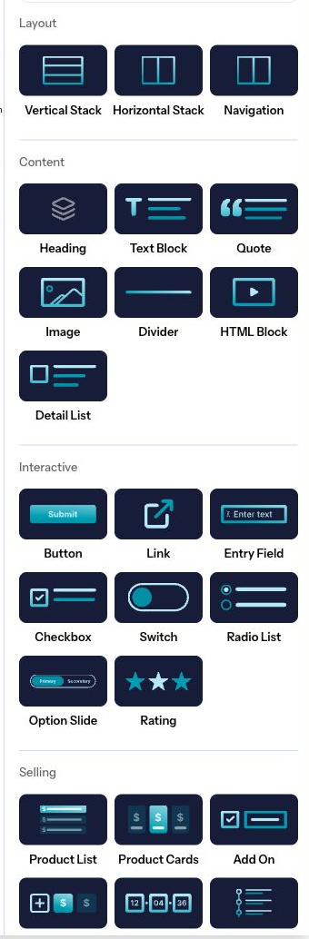
<Tile href="/docs/components/accordions" title="Accordion" description="Two variants" icon="chevron-down">
  <img src="/images/features/checkout-templates/checkout-elements-palette-product.png" alt="Checkout element palette preview" />
</Tile>
Light and dark previews
Imported Mintlify tiles often include separate light and dark preview images. Plandalf preserves the pasted className attributes and renders them as normal HTML class attributes.
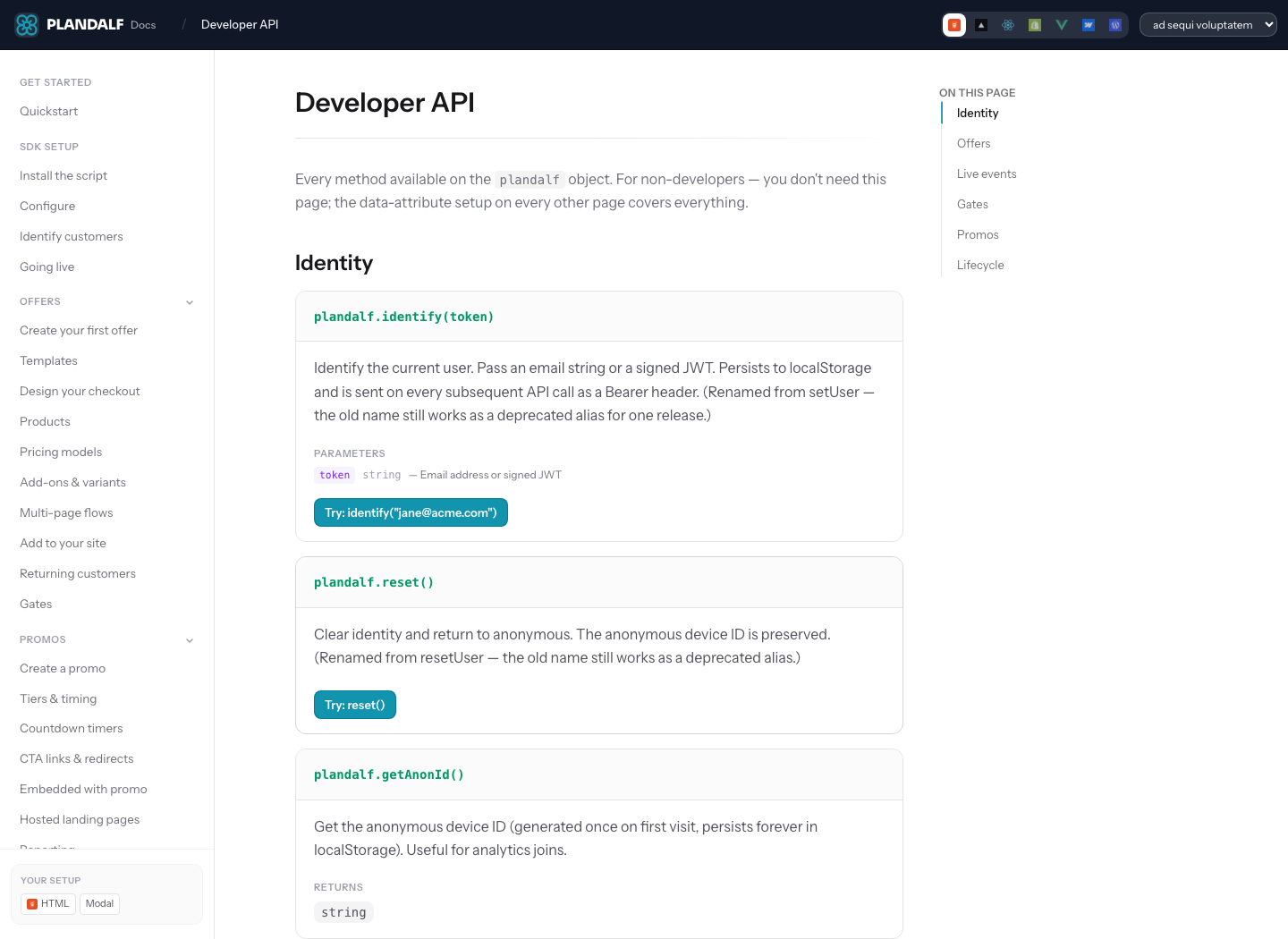
<Tile href="/docs/components/accordions" title="Accordion" description="Two variants" icon="chevron-down">
  <img src="/images/features/checkout-templates/checkout-elements-palette-product.png" alt="Accordion component preview" className="block dark:hidden" />
  <img src="/images/stacks/api-first/numi-api-docs.png" alt="Accordion component preview (dark mode)" className="hidden dark:block" />
</Tile>
Imported Mintlify links
Tiles normalize copied Mintlify docs-base hrefs the same way cards do. A tile authored with /components/cards points to the public Plandalf route /docs/components/cards, and /create/code points to /docs/create/code.
<Tile href="/components/cards" title="Copied Mintlify href" description="Renders as /docs/components/cards." icon="square" />Grid layout
Combine tiles with Columns or TileGroup to create a responsive grid of visual previews.
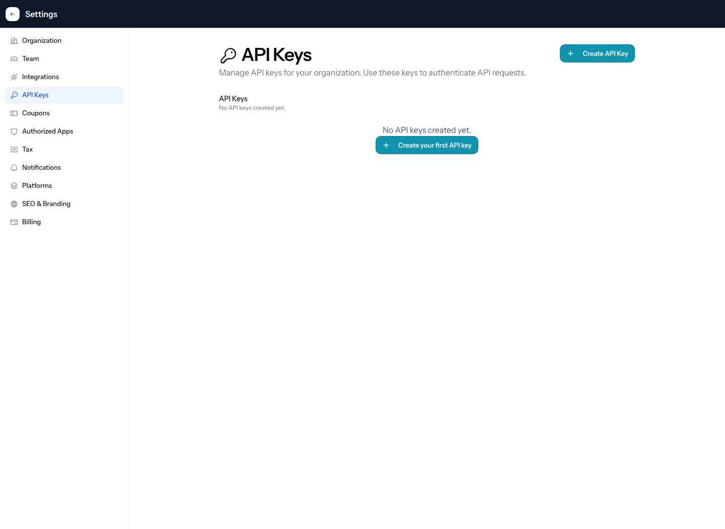
<Columns cols={3}>
  <Tile href="/docs/components/accordions" title="Accordion" description="Two variants" icon="chevron-down">
    <img src="/images/features/checkout-templates/checkout-elements-palette-product.png" alt="Checkout element palette preview" />
  </Tile>
  <Tile href="/docs/components/cards" title="Card" description="Link containers" icon="square">
    <img src="/images/stacks/api-first/numi-api-docs.png" alt="Plandalf API documentation preview" />
  </Tile>
  <Tile href="/docs/components/tabs" title="Tabs" description="Switchable panels" icon="folder">
    <img src="/images/stacks/api-first/numi-api-keys.png" alt="Plandalf API keys preview" />
  </Tile>
</Columns>
Plandalf icon grid
<TileGroup cols={3} gap="sm">
  <Tile title="Offers" icon="package" href="/docs/offers/overview" variant="layer" description="Understand the sale primitive." />
  <Tile title="SDK install" icon="code" href="/docs/sdk/install" variant="layer" description="Add Plandalf to a site." />
  <Tile title="API reference" icon="braces" href="/docs/api/reference" variant="layer" description="Build server-side flows." />
</TileGroup>
Layer cards
Use variant="layer" when the grid is a Kumo-style layer picker: compact, glassy, and meant for scanning.
<TileGroup cols={4} gap="sm" variant="layer">
  <Tile title="Install" icon="terminal" href="/docs/sdk/install" variant="compact" description="Add the package." />
  <Tile title="Configure" icon="settings" href="/docs/sdk/configure" variant="compact" description="Choose mode." />
  <Tile title="Listen" icon="webhook" href="/docs/sdk/events" variant="compact" description="Handle events." />
  <Tile title="Gate" icon="shield" href="/docs/sdk/gates" variant="compact" description="Control access." />
</TileGroup>
Preview tiles
Use image tiles only when the preview adds useful context. Keep the text short so the grid does not become a second article.
Properties
hrefstringrequiredURL to navigate to when users click the tile.
titlestringThe title displayed below the tile preview.
descriptionstringA short description displayed below the title.
childrenReact.ReactNoderequiredContent displayed inside the tile preview area, typically images or SVGs.
Plandalf extensions
iconstringIcon shown beside the tile label. Required for linked tile grids in reviewed Plandalf docs, even when the tile also has preview media.
iconTypestringCompatibility prop for imported Font Awesome-style icon metadata.
variant"auto" | "preview" | "compact" | "layer"default: autoauto chooses a preview layout when media exists. compact works best inside layer groups.
previewbooleandefault: falseForces the preview layout when the tile body is not image-like enough to be detected automatically.
img | imgMediaIdstringOptional media preview from a public path or approved media library record.
alt | imgAltstringAccessible text for image previews.
colorstringOptional accent color for icon-led tiles.
cols | columns1 | 2 | 3 | 4default: 3TileGroup column count. Four-column grids collapse to two columns before mobile.
gap"sm" | "md" | "lg"default: mdTileGroup spacing. Use sm for dense catalogs.
Authoring rules
- Use tiles for catalogs, related pages, and next-step choices.
- Use cards when each item needs more explanation, badges, or longer body copy.
- Give every linked tile an icon, even when the tile also has an image.
- Keep titles short. Move context into
descriptionor the destination page.