
Visual context components
Use Mintlify-style icons, Mermaid diagrams, color swatches, trees, frames, and images to explain implementation context.
Visual context components make implementation details easier to understand when prose alone becomes slow. Use them for diagrams, file trees, color values, screenshots, and compact icon signals.
Use real product visuals
Product UI in docs should come from tracked media or real screenshot components. Do not invent abstract app panels for product behavior.
Icons
Icons can come from the built-in Plandalf set, Lucide names, image paths, or inline SVG. Use icons to label choices, fields, and navigation surfaces.
<Icon icon="package" />
<Icon icon="panel-left-open" />
<Icon icon="/platforms/stripe.svg" />
Mermaid diagrams
Use Mermaid when a process is clearer as a flow. Keep diagrams short enough to scan in the right pane or main article.
<Mermaid title="Offer checkout flow" actions>
flowchart LR
  Page[Sales page] --> Offer[Plandalf offer]
  Offer --> Checkout[Checkout]
  Checkout --> Payment[Payment processor]
  Checkout --> Event[Purchase event]
  Event --> Automation[Automation]
</Mermaid>
Trees
Use Tree, Folder, and File for project structure, generated files, and docs examples that require exact locations.
src
checkout
<Tree title="Example integration files">
  <Folder name="src" defaultOpen>
    <Folder name="checkout" defaultOpen>
      <File name="plandalf.ts" icon="code" />
      <File name="events.ts" icon="bolt" />
    </Folder>
    <File name="env.ts" icon="key" />
  </Folder>
</Tree>
Color
Use color swatches when a docs page needs literal theme values. Swatches are copyable and can show light and dark values.
<Color title="Docs theme swatches">
  <Color name="Aqua surface" value="#e7f9fa" />
  <Color name="Primary teal" value="#0f8f8c" />
  <Color name="Theme-aware surface" value={{ light: "#f8fbfb", dark: "#102326" }} />
</Color>
Images and frames
Use Frame around product screenshots, diagrams, and embeds that need a caption. Use tracked media for product surfaces. Markdown and HTML images are also supported for smaller authoring examples, including noZoom, links, and light/dark variants.
<Frame caption="A tracked product screenshot inside the visual context family page.">
  <MediaImage id="checkout-elements-palette-product-fCvsZ8" alt="The Numi checkout elements palette preview." variant="plain" />
</Frame>
Markdown and HTML images
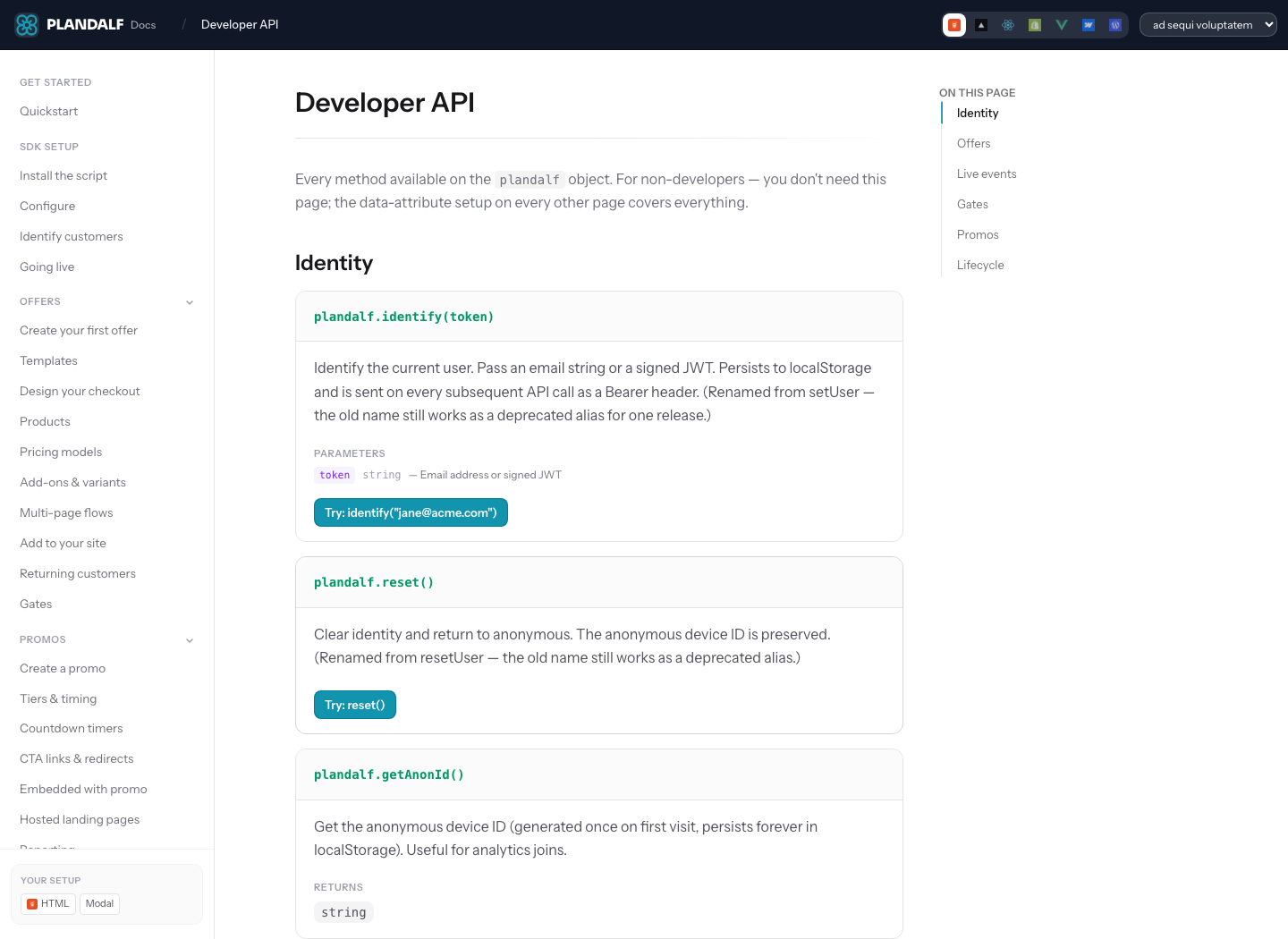
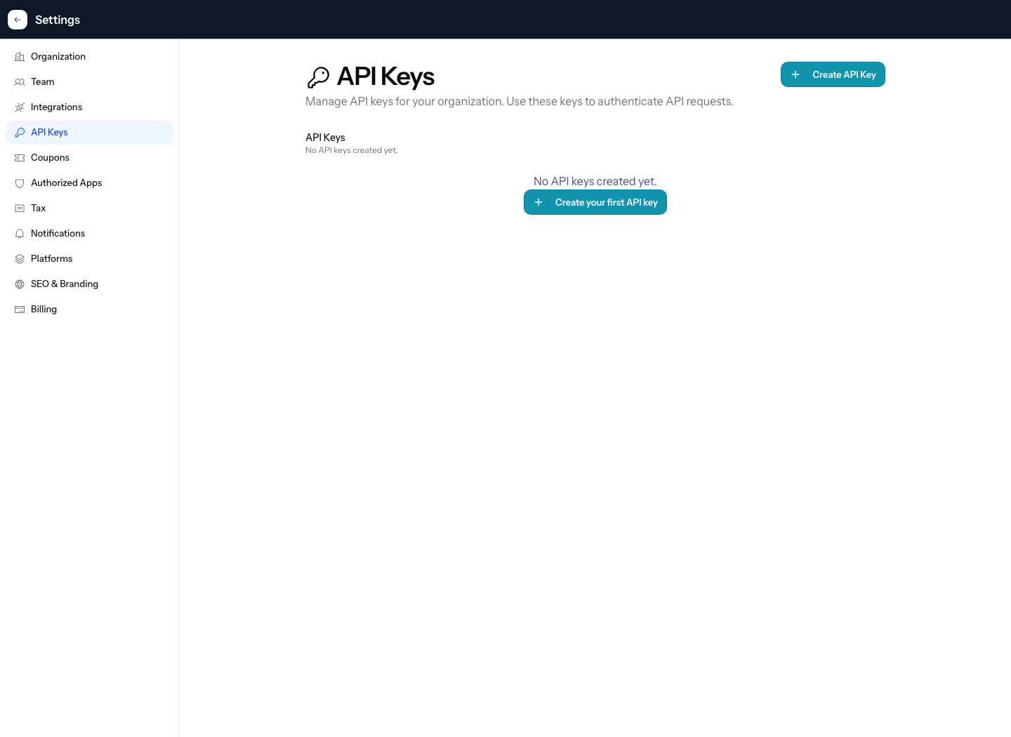
Use Markdown image syntax when the default sizing is enough. Use <img> when the image needs className, inline sizing, noZoom, or a linked wrapper.

<img
src="/images/stacks/api-first/numi-api-keys.png"
alt="The Numi API key settings screen"
style={{ width: "420px", height: "auto" }}
className="rounded-lg border border-neutral-200"
noZoom
/>
<a href="/docs/api/authentication" aria-label="Open API authentication docs">
<img
src="/images/stacks/api-first/numi-api-docs.png"
alt="The Plandalf API docs page"
className="rounded-lg border border-neutral-200"
noZoom
/>
</a>Theme-specific images
Use visibility classes when one screenshot is only correct in light or dark UI. The alt text should still describe the image rather than the theme.
<img
  className="block dark:hidden"
  src="/images/stacks/api-first/numi-api-keys.png"
  alt="The Numi API key settings screen"
  noZoom
/>
<img
  className="hidden dark:block"
  src="/images/stacks/api-first/numi-api-docs.png"
  alt="The Numi Developer API docs screen"
  noZoom
/>
Iframes and embeds
Wrap iframes in Frame so the embed stays within the reading column and cannot create horizontal overflow. Use allowFullScreen and camelCase JSX attributes for video embeds.
<Frame variant="browser" caption="YouTube and iframe embeds should stay inside the docs column.">
  <iframe
    className="aspect-video w-full rounded-lg"
    src="https://www.youtube.com/embed/4KzFe50RQkQ"
    title="YouTube video player"
    allow="accelerometer; autoplay; clipboard-write; encrypted-media; gyroscope; picture-in-picture"
    allowFullScreen
  ></iframe>
</Frame>iframetitle, className, allowFullScreenPlandalf docs render normal JSX iframe attributes. Always include a descriptive title, size the embed with className, and use allowFullScreen when the embedded player supports full-screen playback.
Icon and diagram properties
Icon.iconstringrequiredBuilt-in Plandalf name, Lucide alias, image path, or inline SVG string.
Icon.iconTypestringIcon style metadata from imported Mintlify MDX.
Icon.colorstringOptional local color for inline icons.
Mermaid.titlestringLabel shown above the diagram.
Mermaid.actionsboolean | autodefault: autoShows zoom and pan controls for diagrams that benefit from inspection.
Mermaid.placementtop-left | top-right | bottom-left | bottom-rightdefault: bottom-rightPlaces Mermaid action controls inside the diagram frame.
Tree properties
Tree.titlestringOptional heading above the file tree.
Folder.namestringrequiredFolder label.
Folder.defaultOpenbooleandefault: falseOpens the folder on first render. Use it for the path the reader should inspect first.
Folder.openablebooleandefault: trueAllows the folder to be toggled open and closed.
Folder.iconstringOptional icon override for the folder.
File.namestringrequiredFile label.
File.iconstringOptional icon for code, config, key, or docs files.
Color, media, and embed properties
Color.titlestringPalette heading when Color wraps nested color items.
Color.namestringColor item label.
Color.valuestring | { light: string; dark: string }Copyable color value or theme-aware pair.
Color.variantcompact | tabledefault: compactPalette display style.
Frame.captionstringCaption shown beneath media.
Frame.hintstringShort context line above the media.
Frame.variantdefault | flat | browserdefault: defaultVisual frame treatment.
img.srcstringrequiredImage source for Markdown or HTML images.
img.altstringrequiredAccessible image description.
img.noZoombooleandefault: falseDisables the docs image zoom enhancer for linked images, small logos, or images inside framed components.
iframe.titlestringrequiredAccessible title for an embed.
iframe.allowFullScreenbooleanAllows full-screen playback for video embeds.